Typography
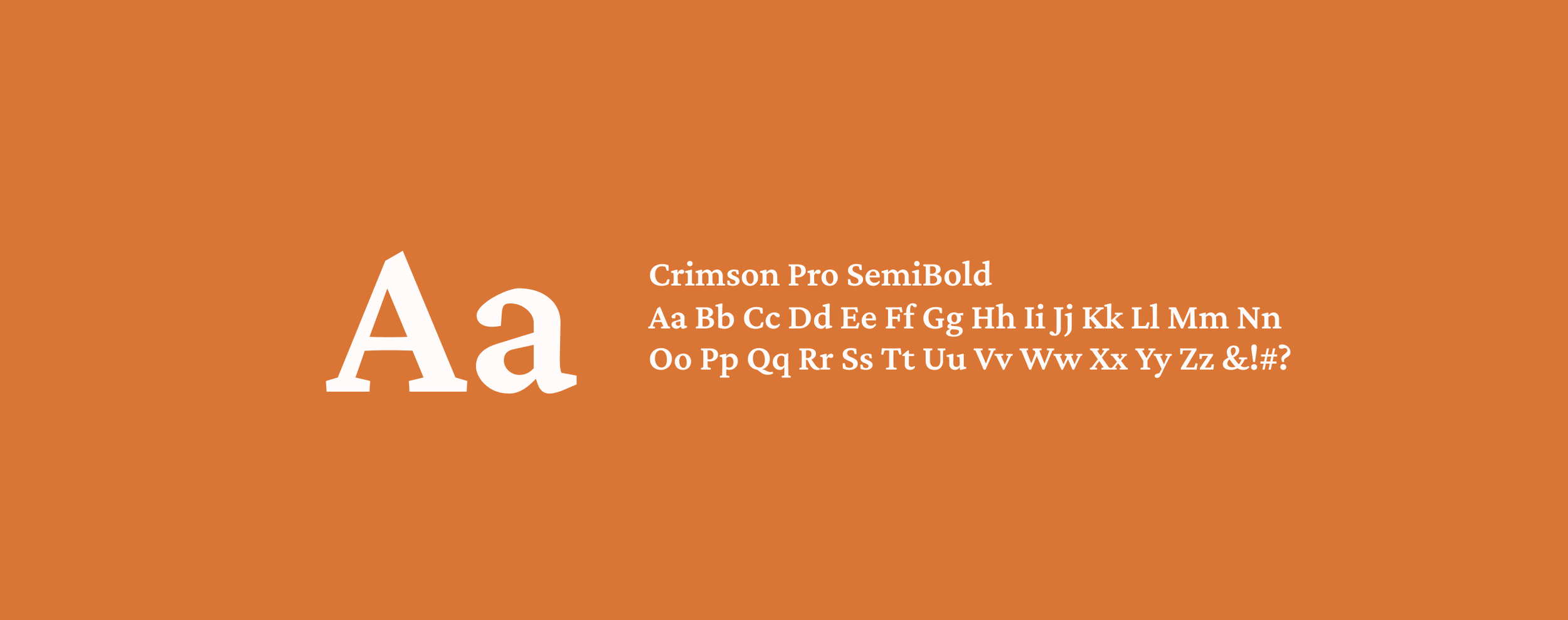
The typography system is designed to support the brand’s sense of tension and restraint while maintaining clarity. Crimson Pro SemiBold serves as the primary typeface, bringing a serious, grounded tone through its classic, authoritative character. Its weight and structure reinforce the feeling of pressure and control present throughout the visual identity.
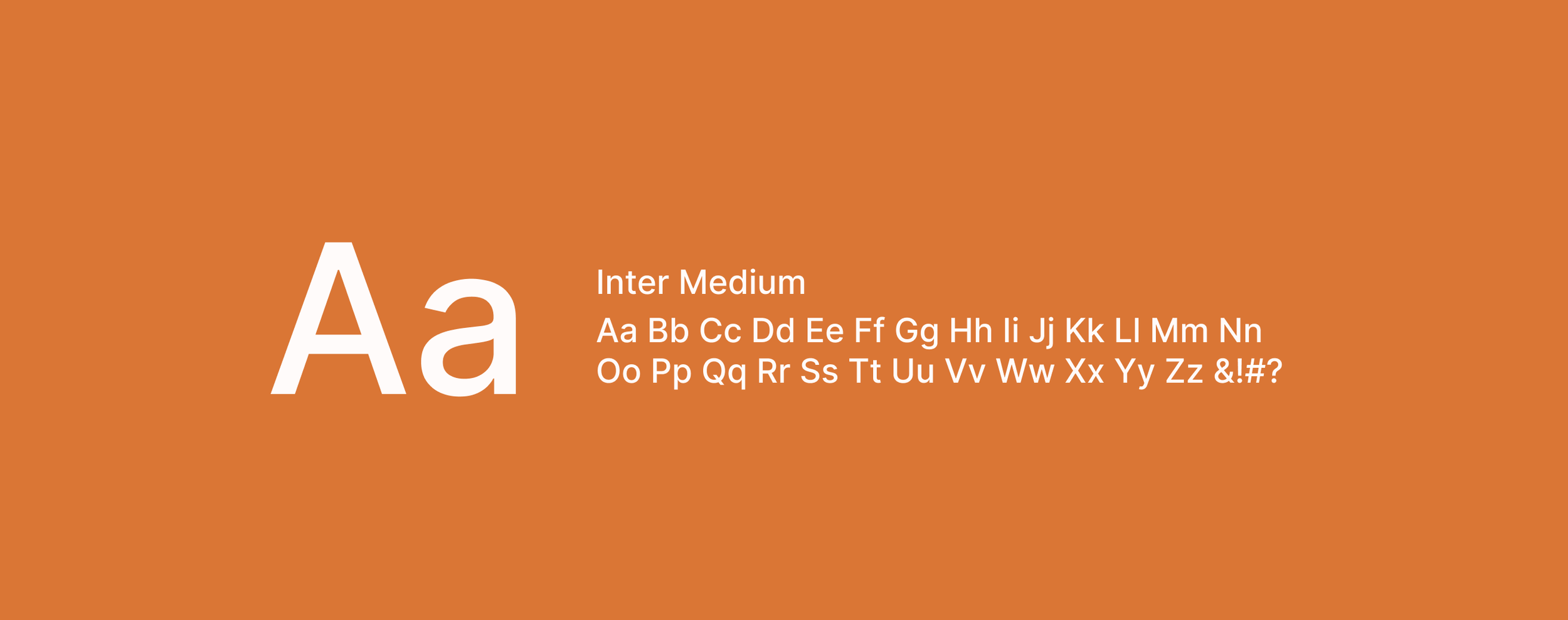
Inter Medium functions as the secondary typeface, providing a clean and modern contrast. Its straightforward, highly legible form introduces moments of clarity within the composition, balancing the intensity of the primary type while still adhering to the overall sense of order and constraint.
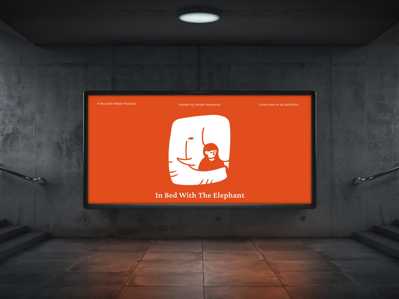
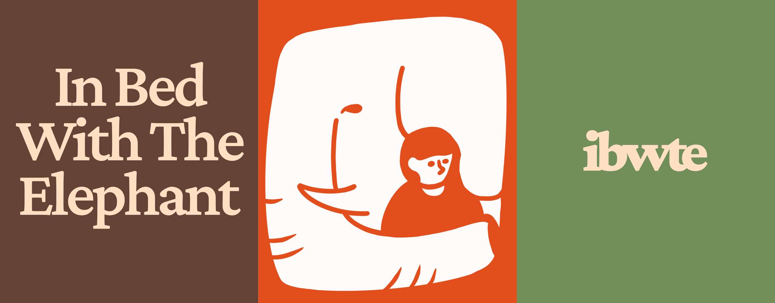
Cover Art
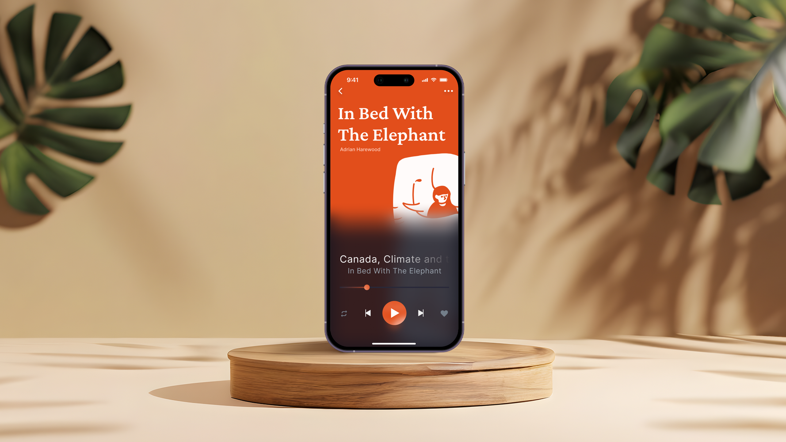
The cover art incorporates the primary color, Autumn Orange, establishing a bold and unsettling visual foundation. The primary logo is positioned in the bottom-right corner, its placement intentionally creating a sense of imbalance and unease that reinforces the underlying theme of discomfort.
To counterbalance the composition, the title and subtitle are placed in the upper-left area, creating a structured layout. This tension between elements mirrors the constrained and uneasy atmosphere central to the concept.